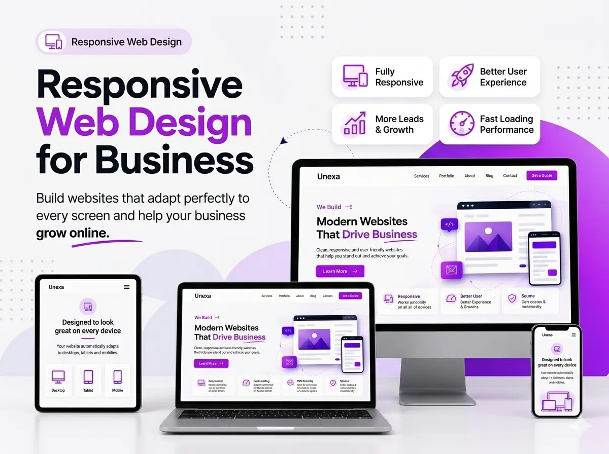
Responsive design ensures your website automatically adjusts to look professional on both desktops and smartphones. By eliminating the need for costly separate mobile sites, it delivers an effortless user experience that protects your brand's credibility, boosts Google rankings, and prevents you from losing mobile sales to competitors.
Why San Diego Businesses Are Losing Local Leads
Business owners know when their website doesn’t look great on a phone, but they don’t realize how much it’s actually hurting their bottom line.
When a potential client lands on a site that’s hard to use, text that’s too small, buttons that don’t tap properly, or a broken layout, they leave immediately. In a competitive market like San Diego, this results in lost leads and sales as visitors heading straight to your competitor in North Park or La Jolla.
Responsive Designed website is more than user experience; it’s about visibility. Since 2019, Google has used mobile-first indexing. This means Google ranks your business based on the mobile version of your site, not the desktop version. If your site isn’t mobile-friendly, it’s almost invisible to the people searching for your services.
If your website is more than 3 years old, there’s a strong chance it’s currently hurting your local SEO San Diego, traffic, and revenue without you even realizing it.
Your Current Site Might Be Hurting Your San Diego Rankings
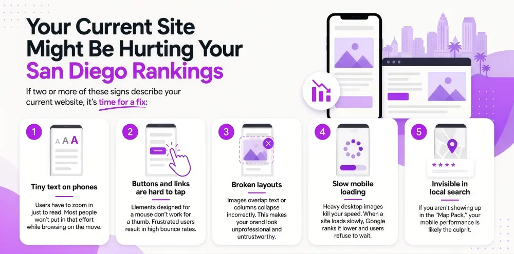
If two or more of these signs describe your current website, it’s time for a fix:
- Tiny text on phones: Users have to zoom in just to read. Most people won’t put in that effort while browsing on the move.
- Buttons and links are hard to tap: Elements designed for a mouse don’t work for a thumb. Frustrated users result in high bounce rates.
- Broken layouts: Images overlap text or columns collapse incorrectly. This makes your brand look unprofessional and untrustworthy.
- Slow mobile loading: Heavy desktop images kill your speed. When a site loads slowly, Google ranks it lower and users refuse to wait.
- Invisible in local search: If you aren't showing up in the "Map Pack," your mobile performance is likely the culprit.
Our Approach to Responsive Web Design in San Diego
Whether you need a brand-new mobile-first web design or want your existing site optimized for every device, we handle both.
1. Building New: Mobile-First From the Ground Up
We don’t treat mobile as an afterthought; we start there. Every layout, button, and image is designed first for small screens and then expanded for tablets and desktops. This ensures your site works perfectly whether a customer is at a desk in Downtown or on their phone at the beach.
2. Fixing Existing: Responsive Redesign for Live Sites
You don’t always need a total website redesign. We conduct a detailed audit using real-world devices (iOS and Android), not just simulators, to see exactly what is breaking. We then fix issues step-by-step: restructuring layouts, optimizing images, and adjusting touch areas while your site stays live.
- Experience in Action: We recently optimized a local service site that was "invisible" on mobile search. By fixing their "thumb-zone" navigation and CSS delivery, we saw a 22% increase in mobile leads within the first month.
What a Responsive Design Project Covers
Every engagement includes a comprehensive technical overhaul:
- Mobile-first layout design: Tested to work across all screen sizes.
- Touch-optimized navigation: Menus and buttons sized for human fingers.
- Image optimization: Compressed files that load fast even on cellular data.
- Speed optimization: Stripping unnecessary code to pass technical SEO audits.
- Cross-device testing: Verified on physical devices to ensure real-world performance.
How Responsive Design Impacts SEO
This is the part most designers miss: Responsive design and SEO are linked together. Every responsive design decision is an SEO decision. Google’s Core Web Vitals—the metrics used to rank your site are measured primarily on mobile. A fast-loading, clean, and structured mobile layout sends a strong signal to Google that your site is high-quality. When Unexa fixes your responsive design, your SEO improves as part of the same process.
Step-by-Step Responsive Design Approach
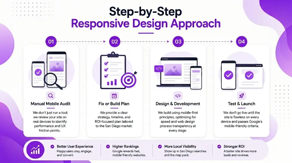
- Manual Mobile Audit: We don't just run a tool; we review your site on real devices to identify performance and UX friction points.
- Fix or Build Plan: We provide a clear strategy, timeline, and ROI-focused plan tailored to the San Diego market.
- Design & Development: We build using mobile-first principles, optimizing for speed and web design process transparency at every stage.
- Test & Launch: We don't go live until the site is flawless on every device and passes Google’s mobile-friendly criteria.
FAQs
"Mobile-friendly" means it doesn't break. "Responsive" means it adapts fluidly. Responsive design is the modern standard Google expects.
In most cases, yes. In a competitive market like San Diego, mobile performance is often the "tie-breaker" that puts you above your competitors in search.
It depends on the original code. After our audit, we’ll give you an honest recommendation on the most cost-effective path.
Find Out If Your Site Is Losing You Mobile Traffic
We’ll take a look at your site and tell you exactly what’s hurting your mobile performance and what it would take to fix it. This is a manual review by an expert, not a bot.